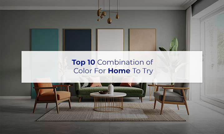
Selecting the right colour palette is more than simply selecting your accent shade, it’s about building balance, improving the mood, and unifying the entire space together. The right combinations can give your space a bigger, brighter, and more balanced concept. Let’s explore how to make colour work effortlessly in your home.
Read Also : Vastu Colours for Home to Attract Positive Vibes
- Classic White & Beige
This classic combination creates a fresh, open space that will not seem dated or old-fashioned. White lightens up the room, while beige provides warmth and softness in your palette. Together, you achieve openness, warmth, and a welcoming feel. This palette is well-suited for living rooms and open concepts. The pairing works well with natural light, textured fabrics, and soft accents that make charm and character.
- Grey & Yellow
Grey offers a simple neutral base, and yellow provides lightness and energy. This contrast creates a fresh yet calm aesthetic that is well-suited to bedrooms, workspaces, or creative spaces. The grey tone retains a good mood, while the yellow adds the highlighted feature and a cheerful boost. Soft yellows can add cheerful charm, whereas striking yellows can create all the drama you want.
- Navy Blue & Off-White
Navy blue contributes richness and depth by providing drama, but remains beautiful and sophisticated. Navy blue with off-white softens the tone and makes it feel more balanced. This pairing works for bedrooms and formal spaces, or any space where sophistication is key. In addition, this combination provides emphasis on architectural details of the space and looks lovely with metallic and wood tones as accents to add texture.
- Pastel Green & Cream
This gentle pairing creates a soothing, fresh environment inspired by nature. Pastel green brings a calm, botanical feel, while cream adds warmth and brightness to the space. Ideal for kitchens, children’s rooms, or cozy corners, this combo supports relaxation and lightness. Add indoor plants or light wood furniture to enhance the natural vibe.
- Charcoal & Blush Pink
Charcoal deepens and adds drama while blush pink softens and assists with a more modern aesthetic. This contrast balances masculine with feminine tones, which is ideal for fashionable living rooms or modern bedrooms. It’s subtle yet impactful and pairs well with matte finishes, rose gold accents, or layered textiles for a cozy, updated look.
- Teal & Mustard
Teal and mustard are both rich, bold colours that make for an energetic palette full of character. Teal is rich, bringing a sense of cool sophistication, while mustard is warm and lighthearted. This colour scheme is great for dining spaces, creative spaces, or a modern apartment because it definitely makes the space stand out. You can complete the look with abstract art or vintage completed furniture for a little personality.
- Warm Terracotta & Soft Grey
Terracotta’s earthy tone adds warmth and groundedness, while soft grey keeps things light and balanced. This palette feels cozy without being dark, perfect for hallways or intimate nooks. It incorporates natural elements like clay pots, linen curtains, or wooden finishes, making it ideal for homes with a relaxed, rustic aesthetic.
- Sky Blue & White
This refreshing pair gives any room a clean, breezy feeling. Sky blue evokes openness and calm, while white enhances light and makes spaces feel more expansive. Use it in bathrooms, compact bedrooms, or coastal-style interiors to promote a peaceful vibe. Add light curtains or seashell-inspired decor for a soft finish.
- Lavender & Silver
The gentle blend of lavender and silver create a peaceful, luxurious environment. Lavender is soothing to the senses, and silver provides a pop of elegance and a hint of shimmer. This combination is great for meditation rooms or bedrooms, which allow for minimal furniture, soft fabric textures, and warm lighting, which create balanced, calm moods.
- Olive Green & Natural Wood Tones
A natural combination that conveys earthy groundedness and an inviting space. Olive green evokes calm and depth, and goes perfectly with natural wood tones. This is perfect for very minimalist or environmentally friendly homes. A perfect choice in living rooms or reading corners filled with handmade or handcrafted decor, natural linen textures, and soft flowing lighting will complete the warm, earthy feeling.